|
Bokeh is another great visualization that has a few advantages in certain situations over Matplotlib and Seaborn. Bokeh generates interactive, html ready visualizations that can be embedded directly into a website. Here, I''ll show you step by step how to take a data set and generate these interactive visualizations. For this tutorial, I looked at baseball data from the 2018 season to see which of the 6 divisions MLB teams are separated into hit the most home runs. I also look to see how each of the 30 teams in the MLB compared when it comes to home runs hit in one season. The data was taken from Sean Lahman's baseball database. For more detail, see the full Repo on my GitHub.
Loading the data and importing libraries
Selecting the right data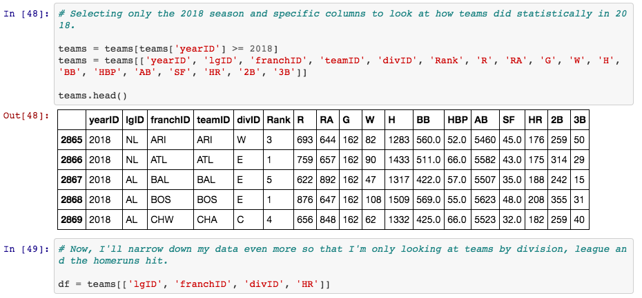
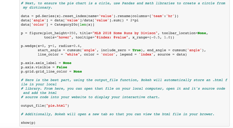
The Pie Chart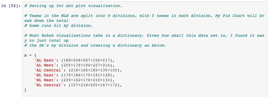
Adding the visualization to your blog or website.
Now, this is the real reason, for me at least, to use Bokeh. Now that you have called the output_file function above, you can go to your local directory to find that file. In this case, the "pie.html" file. Open the file, view it in your browser, open the source code (in Chrome you click View -> Developer -> View Source) and copy the HTML code. Since, for this blog post, I am using Weebly, I simply drag an Embed Code box into my blog post and paste my HTML code into box.
As you can see by scrolling over the slices of the pie, the AL East led the majors with 1030 dingers in 2018, with over 100 more home runs hit than the NL Central.
The Dot Plot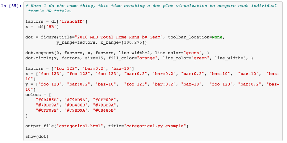
A member of the AL East, the New York Yankees led all of Major League teams with 267 home runs.
Now, you can see how useful Bokeh visualizations can be for Data Scientists communicating their findings through blog posts. Rather than having to copy and paste, or screen shot images, you can create clean, interactive visualizations to be embedded into your site.
0 Comments
Leave a Reply. |
 RSS Feed
